Updated February 5, 2014 to correctly display the LaTeX screenshot, minor prose edits, and added discussion of font styles.
I do not know if you have a favorite font. I do. I really like Microsoft’s Calibri font because it is very readable on screen and paper and it looks professional. With that in mind, it has several huge shortcomings for much work. Let me list
- You don’t have a right to use the font unless you have purchased it (for $120) or acquired with a legal license of a Microsoft product that includes it.
- Calibri does not have small caps family member
- Calibri does not have a corresponding math font
Many people, including me, got to know Calibri because it is the default font in Microsoft Word. I am trying to find a way to leave Word because it has poor support for equation numbering, mediocre bibliography support. It is also difficult to automate updated graphics using non-Microsoft work flow. For example, I often generate graphics in Python with Matplotlib and write them to a file. I would like my document workflow to pick up the picture automatically when it changes but have not found a reliable way to do this in Word.
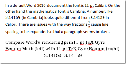
Microsoft Word is fundamentally poor at rendering documents compared to a display tool like Adobe Reader. Consider the following screenshot comparing a default Word document snippet in Calibri with Word’s rendering of text in the TeX Gyre Bonum OpenType font. Next screenshot is from a Word display at 100% zoom.
The shading in the Bonum section is appalling. Look at the dot over the letter i in pi. Word renders the compatible TeX Gyre Bonum Math and TeX Gyre Bonum fonts differently depending on whether it is in equation mode or body text. The shading in the top paragraph is good; however, the overall construction is horrible. In Word a number in equation mode is displayed in the default math font Cambria. Calibri does not match Cambria and the two numbers can’t look the same. Furthermore, the fraction in the middle of the paragraph causes the line spacing to expand just on that line, making it look almost like there are more paragraph breaks than there should be. Distracting and unattractive.
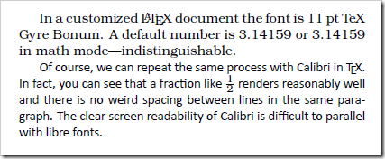
The next picture is screenshot from Adobe Reader X at 100% zoom viewing a LuaLaTeX generated LaTeX document.
First, the TeX Gyre Bonum snippet is readable and reasonably good looking. The math font and text font are indistinguishable, as they should be. LaTeX handles even Microsoft’s pet font Calibri better than Microsoft. The fraction renders clearly and readably. It does so without creating a large horizontal gap.
The ideal faces, from my point of view, should:
- Be embeddable in your electronic documents
- Not cost much to install on every system you want to use (eleven computers at least)
- Work on Windows, Linux, and MacOS
- Include regular, bold, italic, bold italic, small caps, and math families
- Be functional with Word or other non-LaTeX tools.
The license problem is unquestionably the most limiting factor since OpenType now seems to allow fonts to work across platforms. The GUST project has created a series of libre fonts called the TeX Gyre fonts. Among these fonts, only three have the math family, and all three of these satisfy the other requirements.
| TeX Gyre Bonum | Based on URW Bookman L |
| TeX Gyre Pagella | Palatino-like |
| TeX Gyre Termes | Times-like |
There are several other Gyre fonts that are quite attractive and potentially useful but lack the math fonts. TeX Gyre Schola seems to be planning a math font which is not yet ready. If you don’t need to have a math font, or don’t need a matching math font then there are many other fonts to consider. Fontsquirrel has a lovely list of libre fonts. There are other fonts available for LaTeX that can produce good results but do not seem to have a functional method to work with other tools.
Wikipedia describes Calibri as a “humanist sans-serif typeface”. The closest TeX font with math support, to my eyes, is KP Sans-Serif. The strokes are not as modulated so the KP looks less refined than Calibri. I do not see how to use that typeface outside of LaTeX. If you are interested in other LaTeX fonts, consider looking at the LaTeX font project fonts with math support.


