I had no interest in printing at home due to early versions of a study that showed home prints would fade, run, and fail to impress in almost no time at all. That study was updated, and the result made it look like home printing might not be a waste of time.
Also, I was loaned a Canon MX850 all-in-one inkjet printer, scanner, and fax machine, along with some paper. My experience is that home printing offers an exciting way to spend the endless hours I had nothing else to do with. Yeah, I’m blogging now—leave the obvious inconsistency alone, please.
I printed my classic color test photo (see The Color of Software) eight times. I really only wanted to fiddle with color management, but I discovered the true thrill of home printing. My best results were quite suitable for a quick mailing to Great Grandpa or to pass around at work. To save you the bother and expense, do what your printer manufacturer asks: buy their paper and their inks, anything else is false economy.
Printer manufacturers work very, very hard to keep it that way.
The following montage shows scans of a selected area of all eight prints. A key follows, along with some detail blow-ups of the coarse and subtle problems I encountered.
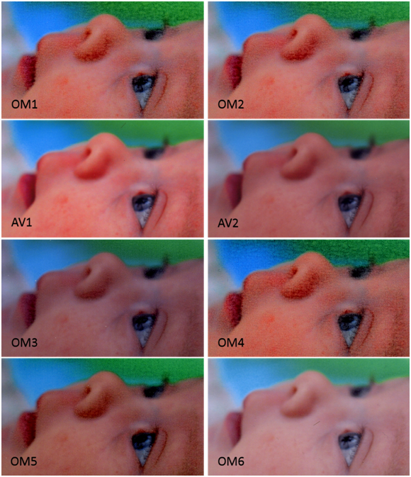
All the variations were generated by changing printer settings or paper. AV stands for Avery paper (#include paper type and number). OM stands for OfficeMax paper.
-
OM1: OfficeMax Paper, printer set to Photo Paper Pro, Optimize and Vivid enabled
-
OM2: OfficeMax Paper, printer set to Photo Paper Plus, Optimize and Vivid enabled
-
AV1: Avery Paper, printer set to Glossy Photo, Optimize and Vivid enabled
-
AV2: Avery Paper, printer set to Glossy Photo, Optimize and Vivid disabled
-
OM3: Glossy Photo, Optimize and Vivid disabled
-
OM4: OfficeMax Paper, printer set to Glossy II, Optimize and Vivid enabled
-
OM5: OfficeMax Paper, printer set to High Resolution, Optimize and Vivid disabled
-
OM6: OfficeMax Paper, printer set to Glossy Photo, Optimize and Vivid disabled, color turned down to -25
In all the OfficeMax (OM) prints there is a glaring flaw, the ink pooled and made little color clumps. It looks dreadful. Many show banding. The Avery (AV) paper worked reasonably well, the color did not pool and the variations are in line with what I expect from turning on “vivid” and “color optimize” modes. To be fair to Office Max, their instructions suggest setting Canon printers to “transparency” mode. This mode is distinctly missing from the MX850 control; every choice available is shown in this next screen shot.
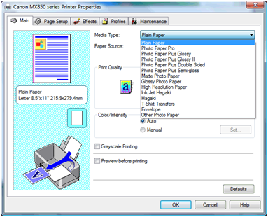
This is probably deliberate on Canon’s part, at least they have a financial incentive to do so. Transparency printing (or printing on high-gloss nearly impermeable paper) uses much less ink. Furthermore, non-Canon papers might work well. Maybe it is not a conspiracy, but quality is clearly not the only metric.
I attempted to approximate the effect of printing transparency by turning down the intensity setting to -25 (see OM6), assuming this would deposit less ink. It deposited less ink, but it also made the photo appear underexposed. Some puddling occurred on her lips even so.
There are different characters of problems as well. The following picture shows some trouble areas in relatively high resolution. The background is the best shot, AV2, which has fairly accurate color representation where generally the color looks almost as good as the print I got from MPIX (currently my favorite lab). The print of MPIX is overall much nicer, but that is due to the higher resolution and the quality of the paper. More on the paper later.
The OM1 inset shows the terrible ink pooling. The AV1 inset shows the deleterious effects of enabling “optimize” and “vivid”, at least on this picture. OM5 shows pooling and banding, though with as bad as the pooling is this might not matter. Finally, OM4 shows fingerprints, which I must have gotten on the paper before it printed. Since I was working with clean hands I can only assume that printing is quite sensitive fingerprint oils.

The papers are quite variable, and the quality of the AV prints was limited by the poor feel of the paper, which was waxy and easily scratched off in my hands. Under glass I doubt this would be an issue, but I’d certainly approach mounting this on paper with caution—frequent bending might cause flaking.
The OM paper was quite nice. Only it is incompatible with the printer, and as such is useless. Clearly home printing is an opportunity to burn lots of time trying to get good results from something that can be quite fiddly. I expect quality and utility would be fine when using the manufacturer’s paper. For the albums, I’ll keep ordering prints. However, I can see a role for a printer when you want something in a hurry.


 But first the history. I got a bad print. Should I have been shooting raw to capture the full dynamic range? Did I goof with some easy white balance or exposure fix in Picasa? Did Winkflash misprint the picture?

