Dip Pens for the Backs of Photos

Quick Recommendation

Speedball B-5 nib

Rapidraw 3084-F or Reeves & Poole India Ink

The best solution I have found for writing on the back of plastic-coated photos, like those from Costco or most modern developers, is drafting ink. It would seem the inks are usually archival even though the paper is not. The writing is actually readable. When the ink is applied correctly it can be handled without risk of smearing in as little as a few minutes.

If you can’t stand my dip pen solution, more details are available here, where I recommended the Zig Millenium (blotted) or the Zig Photo Signature. The problem with drafting inks is that they cannot be applied with a Bic pen. The inks can by applied with technical pens or with dip pens. Technical pens are a delight, you can cap them—or rather you must cap them. They dry out and clog the pen if not cleaned properly. They are difficult to clean too.

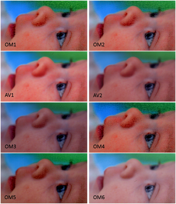
When I’m writing on photos, I tend to do a batch at once, and then none for weeks. Filling a technical pen and cleaning it for an hour’s use is unsatisfying. The alternative to technical pens is the dip pen. Not all dip pens are created equally, or at least not for the same purpose. I had purchased a set of drawing nibs at the local hobby shop thinking I was all set. However, the drawing nibs left puddles of ink on, snagged, and spattered. The photo below shows the bumps and still-wet pools of ink when using some nibs and the smooth, even writing from others.

PensObliqueShot

Different nibs, obviously, perform differently. I thought perhaps different inks would too, and set about to test the pair. A well-performing ink-and-nib combination should

  • apply legibly without spatter
  • leave writing that does not smear after a few minutes
  • be convenient to use

Three simple criteria. Five inks. Six nibs.

Inks

  • Higgins Black Magic (probably latex based) (left)
  • Reeves & Poole India Ink (shellac based)
  • Rapidograph Ultradraw 3085-F (acrylic or latex based)
  • Rapidograph Rapidraw 3084-F (acrylic or latex based)
  • Rapidograph Universal 3080-F (acrylic or latex based)

Nibs

  • Hunt No. 104 (left)
  • Hunt No. 102
  • Hunt No. 56 School
  • Hunt No. 513EF
  • Speedball B-6
  • Speedball B-5

The test involved writing a the ink name and the nib name on the back of a Costco print. The paper is Fujifilm Crystal Archive, which seems to be a common print medium. I wrote each set on the back of the photos. About 24 hours later I scanned the images. After scanning I pressed a wadded facial tissue to the paper and wiped firmly from left to right. Each of the photos below shows the left side, before wiping, and the right side after wiping.

Higgins did not smear, but it did bleed. The detail zoom below is taken from the B-6 test, and the edges are fuzzy and bloomed. This ink, once my favorite, must now be relegated to the scrap.

higgins

higgins_detail


Reeves & Poole had very minor smearing with the No. 56 nib. It puddled horribly with the 513EF and the No. 56. It worked beautifully with the B-5, B-6. The No. 104 and the No. 102 both scraped the paper and left little puddles, but might be acceptable.

reevespoole


The Ultra 3085-F smeared with the No. 56. It was otherwise a stable ink. It performed well with the B-5 and the B-6 nib. The other nibs either puddled or scratched the photo. The detail below is the with the B-5 nib, and though the line is wide, the mark is very well behaved.

ultra_3085F

Ultra3085F_Detail


The 3084-F is darker than the 3085-F, and the ink is as well behaved in the B-5 and the B-6 nibs. I see no reason, based on these data, to prefer the 3085. I should have called it Rapid, not Ultra.

ultra_3084F


The 3080-F is dark, which is good, but the lines are very broad and poorly controlled.

ultra_3080F


Summary of Ink Performance

Ink Rank Comment
Rapidraw 3084-F 1 (tie)  
Reeves & Poole 1 (tie)  
Ultradraw 3085-F 3 Not very black
Universal 3080-F 4 Poor line control
Higgins Black Magic 5 Bleeding

Summary of Nib Performance

Nib Rank Comment
Speedball B-5 1 Well controlled, wide lines
Speedball B-6 2 Well controlled, but very slight blobbing
Hunt No. 102 3 Scratches, lines blob when crossing
Hunt No. 104 4 Scratches, lines blob badly when crossing
Hunt 513EF 5 Puddles badly
Hunt No. 56 School 6 Puddles extremely badly

Zoom Lens Comparison

Firstly, credit where it’s due; the pictures were taken by my friend Robert Hohlfelder.  The pictures were taken of a dollar bill from about 15 feet.  The camera was tripod-mounted, and the lenses with VR had it turned off.  The three lenses are the Nikon 55-200 VR, Nikon 18-200 VR, and the Nikon 70-300ED.  Photos were taken with at f/5.6 and 200 mm zoom.  F/5.6 is fully open for the 55-200 and the 18-200, but not quite fully open for the 70-300.  Robert observed that the 18-200 zoom affords significantly less magnification at 200 mm than the other two.  One questions what the claim for “200 mm” zoom really means.  I’m sure the Nikon Corporation would never fib…

What is most striking is the difference in sharpness.  The obvious winner is the 70-300, a lens that lacks VR, but is probably increasing in value at this point.  The second-place for sharpness goes to the 18-200, and the 55-200 gets the bronze.

The shocking truth is in the pictures.  Judge for yourself.  I’m displaying them larger than their native size so the effect is more obvious.

18-200 f5_6

55-200 f5_6

70-300 f5_6

PaintShop Photo Pro X3

The latest version of Corel Paint Shop Pro is now apparently called PaintShop Photo Pro X3.  Perhaps they’ll eventually regret their ridiculous naming.

Many things are the same since the previous version.  The obvious differences are that the menus have been re-colored to be higher contrast.  I find it overdone and a little garish, but not a big deal overall.  To me the old version (figure right) is easier to read.

menu-cap

The single feature I wanted most from Photoshop’s line was the vibrancy adjustment.  Unlike Photoshop, PaintShop includes the vibrancy adjustment as a standard image operation (accessible through Adjust –> Hue and Saturation –> Vibrancy).  This is considerably superior to Photoshop, which only includes it in the RAW import tool.  The vibrancy adjustment works on 8 bit/channel and 16 bit/channel images like many of PaintShop’s tools, in contrast to most of Photoshop Elements’.  Corel could have done better though; I was disappointed that the vibrancy is not available as an adjustment layer.

Corel upgraded the photo organization tools some, and there are distinct improvements.  Like Picasa and Elements, photos can be grouped virtually into “Collections”.  Other software may call them albums.  The organizer does a passable job of including the EXIF and IPTC data.  Captions in Picasa show up in the “Description” IPTC field, rather than the “Caption” field, so moving between those two programs at least is a little bit of a pain.

The tag editor is quite disappointing, as it does not appear to have any method of making common tags easily accessible—which means typing “Angus Hays” for every picture that includes my dog Angus.

The “email picture” capability did not improve in any important way–it is still just tied to the Windows MAPI system.  Fine if you’re brain damaged enough to use Outlook, but a complete failure for those of us in the Gmail crowd.

The upload tools for interfacing to web services appear to be part of a different application called “Corel PaintShop Photo Project Creator” which rolls off the tongue.  CPSPPC seems to be worthless, as it only interfaces to Facebook, flickr, and YouTube.  There is no option to add plugins or support for Picasa, MPIX, or any of the other services I use regularly.  CPSPPC provides tools to make backups, photo books, uploads, order online (only from Corel’s affiliate, who is not named prior to upload, does not offer an ICC profile, etc.).  Furthermore CPSPPC does not include any of the Photo Organizer’s tools for searching—all the albums you created in PSP Organizer are useless if you want to use them in, for example, a photo book.  Unbelievable, the project manager must be a drooling moron.

Anyway, Picasa offers services like that which are orders of magnitude better than Corel’s or Adobe’s—it is really the photo editing tools that I care about.  It is worthwhile to know that Corel is still ranked third in class on photo organization.

I wanted Corel to include an “Out of Gamut” display to help with color management, and that is sadly missing.  They did not appear to have changed anything about their color management processing at all, it is still basically OK but not exactly mind blowing.

Corel Releases New Paint Shop Pro

Despite Corel’s dreadful marketing, it appears today’s quasi-clandestine webinar was to unveil a new version of Paint Shop Pro, now with the awkward name Paint Shop Photo Pro X3.  For pity’s sake.

However, it appears to have included at least two things I care about:

  • Better speed by multithreading (though there is no indication of GPU-based acceleration)
  • RAW processing including vibrance

You may recall that vibrance was the one feature from Photoshop that I really wanted in PSP, and with that I think we have a nearly complete sweep.

Corel loaded in a bunch of other features that I expect to be disappointed in, such as a photo organizer; it is unlikely they’ll top Picasa for my uses.

You can visit their sales page here.  They are offering a free trial– I will almost certainly upgrade.  With luck I will post a review this weekend.

Old Family Pictures

For Christmas I received a box of slides that had belonged to my grandfather. The slides were 35 mm taken between 1955 and 1961, in a mixture of black and white and color. I do not own a slide projector, and some of the film was starting to deteriorate, by yellowing or showing blotches where the emulsion had retreated. It was apparent that these slides would be much more enjoyable converted to digital, and so I scanned them. This entry is the story of that scanning, for the technical voyeur and for my own notes.

box_open

The first step was to determine the resolution at which to scan the slides, and possibly a lower resolution for the final scan. Usually when I scan photographs I try to scan at about the resolution of the original image–usually about the scale of the “graininess” in the image. If the graininess is smaller than the blurriness in the picture I would scan to fully sample the blurriness, but no finer.

There are some resolution choices to consider that do not require experimentation. Velvia 50, which has a reputation as an excellent film, indicates resolution typically coarser than 150 lines/mm (3,810 lines/inch). 150 lines/mm corresponds to an equivalent of about a 20 megapixel camera. A recent era camera like the Nikon D300 has a 12.3 megapixel sensor, which corresponds to a resolution of 119 lines/mm (3,030 lines/inch), after adjusting to make it 35 mm equivalent.

The following picture shows a portion of a color slide scanned at my scanner’s maximum resolution,12,800 samples per inch, followed by a resampled version of the same image at 2,133 dpi (1/6), followed by too coarse a scan at 1,067 dpi (1/12). Notice that the correct resolution is not far from a 6 megapixel camera, about the same as my Nikon D40.colwideframe

col_multires

The following picture follows the pattern of the color slide, but is of a black and white slide. The resolutions are the same as with the color slide.  For the small parts I have radically stretched the contrast.

bwwideframe

bw_multires

Bit Depth

I scanned at 16 bit/channel (48 bit color) for most slides. The reason to do this is that the slides require some significant color processing. Most of the slides are severely overexposed, and typically badly yellowed. In truth, if I were to simply fix the exposure issues and deal with the yellowing it might be OK to scan with 8 bit/channel. However, it is not clear that this processing is the last these slides will see. While the final output of the process stream will be a JPEG (which is limited to 8 bit/channel) I would like that JPEG to be fully utilized so that future editing does not lead to posterization or banding.

It may be helpful to understand posterization, also called banding. The following picture shows an image with 8 bits per channel, or 16 million colors, then 256 colors, and then 16 colors. Obviously the 16 color version is totally unacceptable. The 256 color version is visibly worse than the 16 million color version, look especially at the reddish object in the lower right.

tooFewColors

The following diagram shows the image and histograms at two stages of processing, one starting with a 16 bit/channel image, and one starting with the same image at 8 bit/channel. Notice how the histogram in the final section of the 8 bit/channel image has deep valleys between the peaks—effectively that histogram is showing banding. Because the banding is nearly invisible in the 8 bit/channel image I think I could reasonably scan at 8 bit/channel; however, it would not take much more processing to produce visible posterization in the image scanned at 8 bit/channel.  The only two operations performed on this scene are contrast enhancement using a “curves” tool and color correction using the “color balance tool”.

color_stretch

Corrections

The slides include a variety of flaws. Most of them are underexposed. Most of them have also yellowed with age. There are places on some slides where the emulsion has what appear to be crystals growing, and others where the emulsion has retreated from small sections.  The following picture shows dark spots in some areas which are the caused by this crystalline looking deposit.

crystals

The following slide has clear parts, where the emulsions appear to have retreated.  On most slides this is only near the edge and the best solution is cropping.  However, on some slides it affects a subject’s face and must be hand painted.

emulsion_retreat

Color correction and contrast enhancement was performed with the “levels” or “curves” controls and the “color balance” tools. The results of those operations are shown on the following image.  The left-most frame is the original scan, which looks like a badly overexposed black and white picture.  The middle image has somewhat better exposure, but looks like a sepia toned image.  The rightmost picture is color corrected, and reveals that photograph was not actually black and white, but a color photo.  Note that this picture isn’t really worth saving due to the motion blur and subject matter, but it is revealing of the impact of basic editing.

color_levels_2

In addition, the process of digitizing the image introduces dust motes and fibers, some of these dust particles are clearly visible in the frames above.  To control the motes and fibers I brushed each slide on both sides, brushed the light source, and cleaned the scanner bed between each scan.

scanner_bed

Most mote correction was accomplished with the clone brush. This worked for any region where the pattern was consistent and broad, such as the sky, or on gravel. However, across people’s faces the clone brush did not produce very good results.

The fibers often crossed faces or fingers, or other hard-to-clone regions. The brush seemed powerless to remove the fibers too, though it was efficient at moving them. The dirtiest slides were scanned twice, with brushing in between. Then the slides were overlaid, masked, and the top slide’s dirty parts erased to reveal the clean slide underneath.

While the method is effective, it is also a pain. In addition to doubling the scanner time, it increased the processing substantially. The slides had to be registered very accurately for the method to work. This required careful positioning, and rotation. Both operations were agonizing due to my computer speed. For color slides it was nearly intolerable, as my software crashed when I tried to use more than one color 16 bit/channel layer.

For reference, to register two images you take the two scans and make them layers in a single image, then set the “blend mode” to “difference”.  Perfect registration will reveal a black screen.  The figure below shows the full image on the right, and the difference image on the left.  The white outlines tell that I don’t have the image exactly registered, perhaps the rotation is a little wrong.registration

The layers that comprise a finished product include the two “rasters” and the “mask”, as shown in the layers dialog below.

layers_palette

Except for some scripting to automate the resizing, that is all the processing I did.  May my example be of service.

Focus Stacking and a Moth

We found this really neat moth on our porch several days ago. It had already departed. It was in immaculate condition, and seemed the perfect opportunity for some focus stacking effort. As usual I used CombineZM for the processing, and my Nikon D40 with el cheapo Phoenix 100mm f/3.4 macro lens. Combination of about 20 photos, if I remember accurately. Anyway, for those of you who use CombineZM, the produced the following was the weighted average method.

I will award 5 points to anyone who can identify the stacking artifacts in this picture.

Canon MX850 with Canon Paper

I revisited printing with the Canon MX850 this weekend. I printed a 4-image collage on a sheet of 8.5×11 inch Canon Glossy Photo paper. I had the printer settings for optimization and enhancement disabled, since this gave the most accurate printing in previous trials. The results are shown below. Note that my scanner pooped out about 1/3 of the way through the picture—I presume not permanently—so the images aren’t exactly the same scale and crop.

There is, maybe, a slight reddish shift in the left frame, but it is quite good overall. This print will go on display at the office. For album use, the resolution of the professional print services is better, but for most uses the printer is quite good. For anything hanging on a wall, this is great.

Vibrance

Photoshop’s Camera Raw tool, for importing RAW camera images, provides a really delightful little slider called “vibrance”. Paint Shop Pro does not. I read one post suggesting that vibrance was effectively increasing saturation on low-saturated areas. I decided this would be worth trying to emulate in Paint Shop Pro with some layer magic. The results are shown in the comparison image below. My previous posts show how lifeless this image is right out of the camera. In the comparison, the only difference between before and after is the application of pseudo-vibrance. Skin tones are pretty good, given how much increase in saturation is visible in the toy.

To do this in PSP, open your RAW (or other file). Then split channels to hue, saturation, and lightness, or HSL. Note that PSP can only do an HSL split on images with 8 bits/channel, so it will prompt you to reduce the color depth. Let it, but as soon as it has generated the H, S, L images go back to your original and “undo”—this will restore the original color depth.

After splitting to channels your screen should look a little like the following. The original is in the subwindow DSC_0006 and the channels are in Hue3, Lightness3, and Saturation3. You can close the Hue and Lightness window—we will only be using the Saturation window.

Return focus to the original image. Add a new adjustment layer, with type Hue/Saturation/Lightness. Crank up the saturation to 50 or so—well past the crazy level that you would never, ever, use in a real photo. The effect will be attenuated by adding a mask.

The layers palette will now show the background, and on top of that a Hue/Saturation/Lightness layer.

Change window back to the Saturation subwindow, select all, and copy. Jump back to the original window. Select the adjustment layer by clicking on it in the layers palette. Then “Paste Into Selection”, which will embed a mask into the adjustment layer.

You can now see a small black and white image of the saturation channel in the layer thumbnail.

That’s it. Adjust the saturation until it looks good.

Benefits and Drawbacks

Compared to Photoshop, this process is definitely a hassle. I haven’t determined if it can be scripted, but I’m certain there are keyboard shortcuts to speed the process along. There are benefits, though. In Photoshop Elements, once you set the vibrance in the import utility you’re done. If you decide later that you want to tweak the vibrance you have to go back to square one. In PSP you retain the adjustability, at the full 16 bits/channel, and you can layer in other adjustments, like levels. Furthermore, you can change how the effect is applied by adjusting the mask. For example, you can apply curves to the mask layer to change which portions of the picture are affected. I think that kind of adjustment would be fiddly, though.

Final note: I may actually be turning up the saturation on more saturated sections, rather than on less. The effect seems to work however. I did try using the inverse mask, and that may result in pleasing images, though in this case the image looked flatter, not more colorful.

Canon MX850 and Home Printing Foibles

I had no interest in printing at home due to early versions of a study that showed home prints would fade, run, and fail to impress in almost no time at all. That study was updated, and the result made it look like home printing might not be a waste of time.

Also, I was loaned a Canon MX850 all-in-one inkjet printer, scanner, and fax machine, along with some paper. My experience is that home printing offers an exciting way to spend the endless hours I had nothing else to do with. Yeah, I’m blogging now—leave the obvious inconsistency alone, please.

I printed my classic color test photo (see The Color of Software) eight times. I really only wanted to fiddle with color management, but I discovered the true thrill of home printing. My best results were quite suitable for a quick mailing to Great Grandpa or to pass around at work. To save you the bother and expense, do what your printer manufacturer asks: buy their paper and their inks, anything else is false economy.

Printer manufacturers work very, very hard to keep it that way.

The following montage shows scans of a selected area of all eight prints. A key follows, along with some detail blow-ups of the coarse and subtle problems I encountered.

All the variations were generated by changing printer settings or paper. AV stands for Avery paper (#include paper type and number). OM stands for OfficeMax paper.

  • OM1: OfficeMax Paper, printer set to Photo Paper Pro, Optimize and Vivid enabled
  • OM2: OfficeMax Paper, printer set to Photo Paper Plus, Optimize and Vivid enabled
  • AV1: Avery Paper, printer set to Glossy Photo, Optimize and Vivid enabled
  • AV2: Avery Paper, printer set to Glossy Photo, Optimize and Vivid disabled
  • OM3: Glossy Photo, Optimize and Vivid disabled
  • OM4: OfficeMax Paper, printer set to Glossy II, Optimize and Vivid enabled
  • OM5: OfficeMax Paper, printer set to High Resolution, Optimize and Vivid disabled
  • OM6: OfficeMax Paper, printer set to Glossy Photo, Optimize and Vivid disabled, color turned down to -25

In all the OfficeMax (OM) prints there is a glaring flaw, the ink pooled and made little color clumps. It looks dreadful. Many show banding. The Avery (AV) paper worked reasonably well, the color did not pool and the variations are in line with what I expect from turning on “vivid” and “color optimize” modes. To be fair to Office Max, their instructions suggest setting Canon printers to “transparency” mode. This mode is distinctly missing from the MX850 control; every choice available is shown in this next screen shot.

This is probably deliberate on Canon’s part, at least they have a financial incentive to do so. Transparency printing (or printing on high-gloss nearly impermeable paper) uses much less ink. Furthermore, non-Canon papers might work well. Maybe it is not a conspiracy, but quality is clearly not the only metric.

I attempted to approximate the effect of printing transparency by turning down the intensity setting to -25 (see OM6), assuming this would deposit less ink. It deposited less ink, but it also made the photo appear underexposed. Some puddling occurred on her lips even so.

There are different characters of problems as well. The following picture shows some trouble areas in relatively high resolution. The background is the best shot, AV2, which has fairly accurate color representation where generally the color looks almost as good as the print I got from MPIX (currently my favorite lab). The print of MPIX is overall much nicer, but that is due to the higher resolution and the quality of the paper. More on the paper later.

The OM1 inset shows the terrible ink pooling. The AV1 inset shows the deleterious effects of enabling “optimize” and “vivid”, at least on this picture. OM5 shows pooling and banding, though with as bad as the pooling is this might not matter. Finally, OM4 shows fingerprints, which I must have gotten on the paper before it printed. Since I was working with clean hands I can only assume that printing is quite sensitive fingerprint oils.

The papers are quite variable, and the quality of the AV prints was limited by the poor feel of the paper, which was waxy and easily scratched off in my hands. Under glass I doubt this would be an issue, but I’d certainly approach mounting this on paper with caution—frequent bending might cause flaking.

The OM paper was quite nice. Only it is incompatible with the printer, and as such is useless. Clearly home printing is an opportunity to burn lots of time trying to get good results from something that can be quite fiddly. I expect quality and utility would be fine when using the manufacturer’s paper. For the albums, I’ll keep ordering prints. However, I can see a role for a printer when you want something in a hurry.

Color (White) Balance

A friend of mine suggested my first two posts were pretty difficult to follow. To address that, this is the first in a series of posts which will ramble on about other interesting digital photography topics in a more accessible way. Feedback is appreciated.

There are lots and lots of tutorials on the net, so consider this a teaser—if you want details our good friends at Google will help.

In my order of importance, the technical aspects of taking a good photograph are

  1. Focus-if your subject is out of focus you’re stuck. There is no way to post-process to fix bad focus.
  2. Framing-cutting someone’s face off is also uncorrectable. Almost as bad is getting too much of everything else and not enough of your subject.
  3. Exposure-though as long as you don’t underexpose or overexpose too much you can do some recovery in the computer. Flash can make this very challenging.
  4. White balance-people should not look greener, yellower, or redder than they naturally are. Often this is correctable in the computer, but it is really fiddly—getting it right in-camera can save a lot of time.

The other stuff is compositional—are your subjects’ smiling, is motion blur minimal, are flash shadows tolerable, and is the view interesting. Good compositional skills are what separate a really good photographer from, well, me. This article is about white balance. Just because it is number four on the list doesn’t mean it isn’t important. To get a feeling for just how important it is, look at the collage below—which shows the same picture rendered with a variety of white balance settings.

These pictures were shot inside my light box (a bucket) under natural light. In the custom setting I manually evaluated the white balance. I shot this picture in raw, and then applied the color corrections in Paint Shop Pro. This might mean the color casts are the opposite of what would be seen if I shot the picture in the claimed light with the wrong setting on the camera.

Color can be subtle, because although it is absolute in objects it is not absolute in perception—the proportion of colors an object reflects doesn’t change, but the apparent color certainly does. Our eyes and brains do an amazing job of figuring out what the true colors of objects are, even though the light can vary from, for example, the yellow of a sodium vapor lamp to the cool white tones of a fluorescent tube. Our brains can do this by processing cues from the environment around the things we’re looking at.

Cameras, however, capture a scene. The environment surrounding the scene is not recorded by the camera. Because of that we draw the color cues from the area we are in when we are viewing the picture, not the area the scene was in. In order for the colors in a picture to look good to us the camera (or post-processing) must render the neutral colors in the scene as neutral colors in the image. In other words, the camera has to remove the effects of weird lighting.

Generally your camera does an amazing job of compensating for the color cast of the scene lighting. With white balance set to “auto” most cameras, including my Nikon D40, Canon S2IS, Canon G3, and Canon SD100IS all do a fantastic job—usually. They don’t always, though.

I speculate that a camera’s white balance compensation works by having the camera select the most neutral portion of the image and assuming it is completely neutral, to first approximation. That is, the camera assumes any color cast in the most neutral parts of the image is due to color cast in the lighting, and it compensates it out. Experience has told me that camera processing is somewhat more complex; however, I find this model works well at predicting when I will need to be careful with colors.

When I’m shooting a scene with nothing neutral in it, I’m sometimes better off with a manual white balance setting. This happens a lot when I put my baby on a dark blanket—which I do sometimes to get a good contrast.

Shooting for Good White Balance

The best choice about nine of ten times is to leave your camera in auto. If you fiddle with white balance settings it is just a matter of time before you leave it in some weird manual mode just when Baby is doing something cute. And then Baby is forever remembered doing something cute while being green.

Sometimes, though, you want perfection. Then the best bet is to set your white balance to “custom”. Custom settings work by having the photographer place a neutral object at the site of the subject, and then taking a picture (in the custom evaluation mode). You can buy special neutral cards to carry, but I’ve had excellent success with just a plain sheet of paper—which I carry folded up in my camera bag.

Be creative in a pinch. I once saw a TV cameraman pull one leg up and bend the camera down to his ankle to set the white balance on his sock.

Two Lights

It happens pretty often that I have two sources of light. Most commonly there is an ambient light, fluorescent in the kitchen, natural near the windows, tungsten/incandescent in the dining room, and the flash. These sources sometimes come from different directions and light different parts of the scene. On the left of the picture below you can see the color comes from the room light, and on the right it comes from the refrigerator light. This picture doesn’t suffer for it, since we would see it as entirely normal. If the color came instead from the flash, however, this effect would be very awkward looking.

I don’t have a way to fix this kind of error, except to avoid it in the first place. If you have time to set up you can put compensating gels over the flash (which works really, really well). Alternatively, you can try to find an orientation that minimized the effect. If you’re me, and you’re photographing people, you just live with the bad color balance. Except for portraits, and then I use gels, manually set the white balance, and maybe shoot raw just in case. Raw is, generally, more correctable.